Streamlining Analytics & reporting
Sales Tracker Dashboard
Role
Lead Designer
Tools
Figma, Looker Studio, Google Analytics
Sector
Hospitality
Project overview
As part of my role at itison, I designed and developed a centralised sales tracker dashboard to support internal teams across our owned venues.
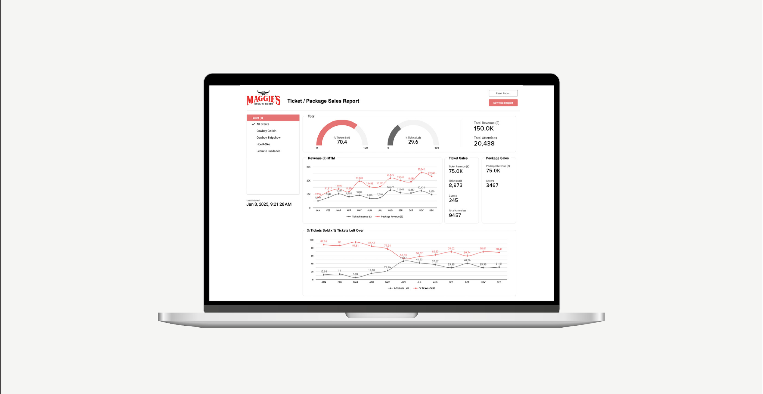
The dashboard provides real-time visibility into ticket and package sales, site user behaviour, and overall event performance. Key metrics include total sales, visitor numbers, and the percentage of tickets sold vs not sold. This allows the marketing and bookings teams to make data-driven decisions and quickly assess how each event is performing month to month.
All data shown in mockups is fabricated and used for illustrative purposes only to protect sensitive business information.
1. research & discovery
The Challenge
Access to sales and performance data was limited, relying on manual reports available to only a few team members. This lack of visibility made it difficult for the wider team to track event performance or make timely, informed decisions.
The Solution
Initially, all team members were given access to the sales platform, but the raw reports were difficult to interpret. To improve accessibility, I created a Google Looker Studio dashboard that presented key data in a clear, visual format—making performance easy to understand at a glance for everyone.
Research & Team Collaboration
To ensure the dashboard would be useful to those using it day-to-day, I spoke with the marketing and bookings teams to understand which metrics mattered most to them. Their input helped shape the dashboard, including features like venue filters and clearer monthly performance insights.
2. Design
Defining Key Metrics & Structuring the Data Source
With the team’s needs defined, I identified the core KPIs and set up a structured Google Sheet as the central data source, alongside Google Analytics. This ensured key metrics - such as sales, visitors, and bookings - could be cleanly and reliably pulled into Looker Studio.
Visual Design & User Experience
I used simple visuals, including line graphs, to make trends easy to spot at a glance. For example, monthly sales graphs highlighted performance patterns across the year, resulting in a clear, user-friendly dashboard with instantly accessible insights.
Structure Layout
The dashboard was divided into three core sections to reflect the most relevant performance areas:
Tickets Sold vs Left Over
Revenue Month-to-Month
Total Ticket & Package Sales
Each section gave the team a clear, segmented view of sales and attendance data. I also included interactive filters to allow users to explore the data in more depth - filtering by individual venues, events, and spaces.
3. testing & results
Improved Access & Team Enablement
With the dashboard in place, the wider team can now easily access performance metrics. This has enabled them to monitor sales, spot underperforming events, and make quicker, more informed decisions on what to promote.
Backdated Data & Ongoing Reporting
Although the dashboard was built in Q4 2024, I backfilled data from earlier in the year to provide a full year-to-date view. At the start of Q1 2025, I shared PDF summaries with the team, making it easier to highlight trends, identify top and low performers, and support future planning.
Final Result: Ticket Sales Increase
The dashboard also revealed deeper, event-specific trends. For example, analysis of Sloans’ “EatFilm” events showed that romantic comedies performed best in winter, while musicals were more popular in spring and early summer.
Using these insights, the team adjusted the 2025 schedule—shifting more musicals to May. This led to a 15% average increase in ticket sales, with some films seeing improvements of nearly 50% compared to 2024.